why beige is BORING and how bold hues supercharge your brain 🧠
OVERLOAD | how we slid into the neutral desert
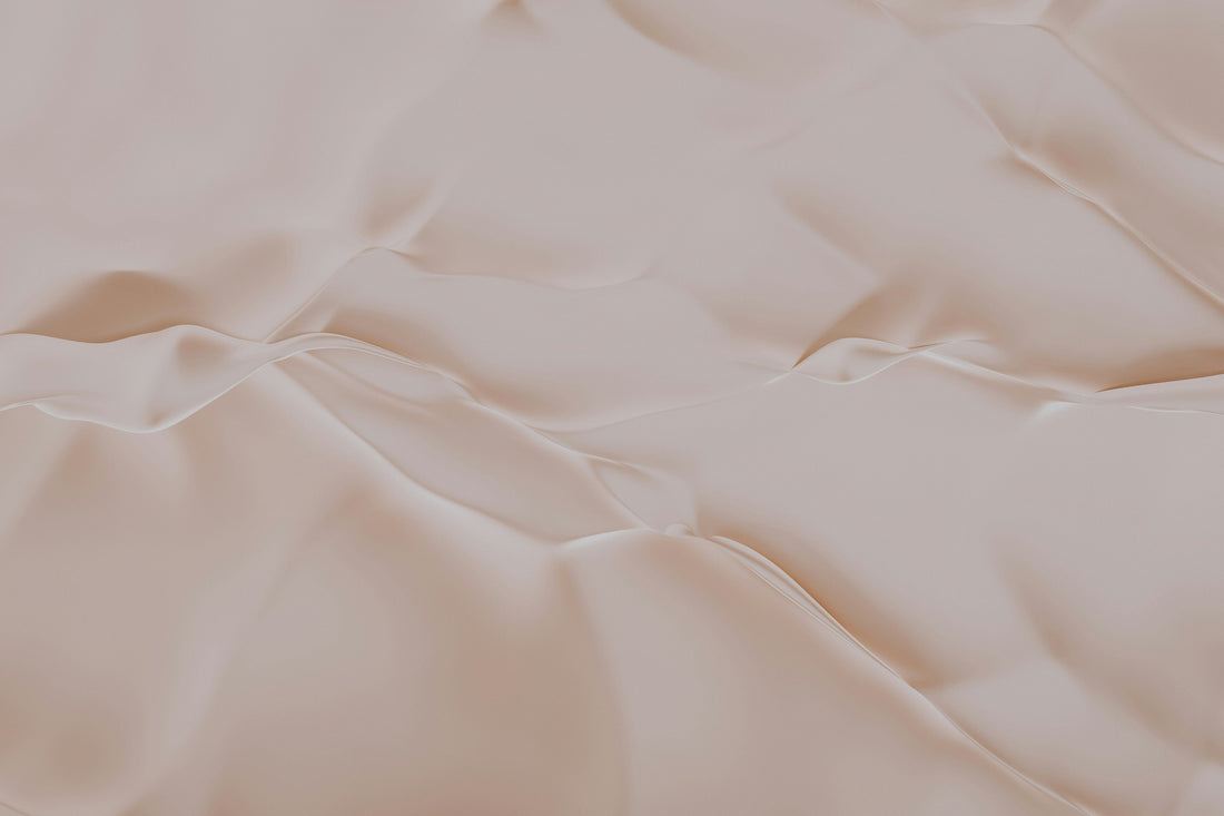
Open Instagram, Pinterest, or your favorite design blog and you’ll spot the same soothing palette: sand, beige, off-white, maybe a lonely terracotta vase for “contrast.” Minimalism had good intentions - calm vibes, clean lines, less visual clutter - but we accidentally pushed the mute button on our mood.
Human brains are wired for contrast. When every wall, couch, and cushion sits on the same tonal frequency, sensory hunger creeps in. Under-stimulated brains drift toward boredom and low-grade blues (yes, studies actually show it). So if your living room looks lifted from a beige Etsy mood board, it might be quietly stealing your sparkle.
FIREWORKS | what color does to the brain
Color isn’t just decoration; it’s raw neurological input. Light waves hit your retina, convert to electrical signals, and sprint straight to limbic regions that manage emotion, motivation, and memory. Within milliseconds the brain drops a chemical mixtape:
| hue family | neuro reaction |
| Warm reds, oranges, yellows | Dopamine bump → higher heart rate, alertness, motivation |
| Cool blues and teals | Lower pulse, reduced cortisol, “safe-place” signals |
| Fresh greens | Creativity lift, mental restoration (our hunter-gatherer brain loves “green = life”) |
| Deep violets | Subtle luxury, introspection |
In short: color is therapy you don’t have to book.
HORMONES | color vs. the home-office blues
A University of Essex experiment showed that just five minutes of looking at bright spring-green scenery slashes stress markers. If you can't place your desk in front of the window to look into the nature - translate that indoors and you get the easiest mood upgrade ever: a leaf-green throw over your chair, lemon-yellow stationery on your desk, or a potted Monstera in the corner.
Pair that greenery with pops of yellow and your reward system starts humming - perfect for energy-slumps around 3 p.m. when the snack drawer suddenly looks romantic. Maybe you don’t need another latte; maybe you need a brighter notebook cover.
STRESS | blues and greens as optical chill pills
Remember the last time you gazed at open water or a forest canopy and felt your shoulders drop? That’s ancient survival wiring whispering, “We’re near water and food - relax.” In interiors, soft aqua walls, sea-glass tiles, or a moss-green rug can replicate that effect.
Not ready to paint? Dunk the room in color with smart lighting or lay down a light blue throw rug. The point: let your parasympathetic nervous system clock out for the evening.
BRAINSTORM | unleash creativity with color zoning
Divergent thinking (aka. big-picture idea storms) flourishes in blue-green environments. Need laser-focus for proofreading or invoicing? Add a precise pop of red - think a scarlet office chair or a cherry-red pin board. The brain responds to these visual cues the way athletes respond to a starter pistol.
Practical recipe:
1. Paint the wall behind your desk in powder-blue or sage.
2. Add one punchy red object inside your peripheral view.
3. Watch your brainstorming session go from “meh” to mind-map mania.
COLOR HACKS | for everyone
⚡ hack 1 | paint with smart lightning
Smart bulbs are basically mood magic wands. Philips Hue (with endless high quality smart products) lets you swipe from Arctic-cool daylight (hello, morning emails) to a fiery tangerine glow for Friday-night tacos. Even though Philips is more expensive than its competitors, I feel it still delivers best quality in terms of light and reaction time. Personal favorite: the Hue Lightstrip. Paste it behind a shelf, set it to an orange fade, and you’ve got an instant dopamine wall without a single brush stroke.
🎨 hack 2 | our bold prints (shameless plug, totally worth it)
Not ready for a technicolor sofa? Roll out a set of our high-vibrancy art prints. We curate pigments so saturated they practically hum-sun-yellow lemons, jungle-green monstera leaves, electric-pink abstracts. Hang three in a row for a “gallery hit,” or scatter them across shelves like chromatic Easter eggs. Zero tools, maximal happiness.
🛋️ hack 3 | textile swap-outs
Covers, throws, curtains - soft goods are the shape-shifters of interior design. Grab two accent colors from your favorite print, then echo them in cushions, candles, or even a bold shower curtain. Suddenly the room feels curated, not chaotic. Total time investment: one evening + your favorite playlist.
THE MIX | the 60-30-10 rule (and when to break it)
Design school trick: pick
- 60 % base (walls, big furniture)
- 30 % secondary color (rug, curtains, bedspread)
- 10 % eye-popping accent (lamps, vases, our prints)
Starting beige? Keep the 60 % neutral and ramp up the other two slices. After a week you’ll want more—trust the process. Break the rule once you feel comfortable; some of the happiest rooms flip it entirely (hello, cobalt-blue library!).
CALL TO ACTION | your brain wants a color snack today
Color lowers stress, lifts motivation, sparks creativity, and costs less than your last streaming subscription. So pick a palette that makes you grin—then sprinkle, paint, or light it into your space.
Swipe a Hue scene, order a punchy print, toss a teal pillow, dance around in dopamine. Your mind will shower you with serotonin confetti, and beige will wonder why you ghosted it.
TL;DR? Beige had its run. The future is polychrome. Let your home—and your head—party in full spectrum.